Chosen Theme: How to Select Colors for Cityscape Art
Discover how to select colors for cityscape art with confidence and flair. We’ll translate bustling streets, glowing windows, and changing skies into palettes that feel alive. Join the conversation, share your favorite urban hues, and subscribe for weekly palette challenges inspired by cities around the world.
Warm and Cool: Managing Energy and Calm
Warm colors amplify motion, traffic, and nightlife; cool colors soothe concrete expanses and open skies. Use warm highlights to suggest activity, while cool planes create breathing room. Which combination captures your city’s pulse?
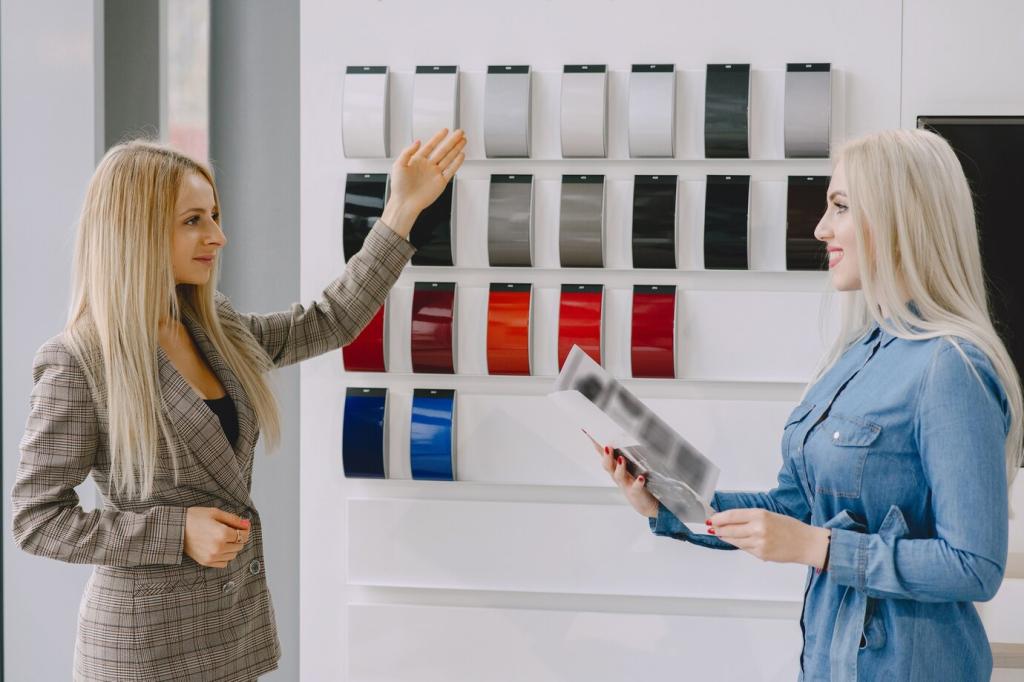
Every city has a chromatic fingerprint—brick reds, river greens, sandstone beiges, or neon strips. Observe signage, transit lines, and historical façades. Share a photo and note the three hues that say, unmistakably, home.
At golden hour, glass turns into liquid copper, and asphalt reflects warm gradients. Push oranges with tempered violets for shadow planes. Try a limited triad, then post your swatches for feedback from fellow readers.
Overcast and Fog: Silent Chromas, Gentle Edges
Cloud cover compresses value range and mutes saturation. Mix grayed mixtures from complements, letting subtle temperature shifts suggest depth. Have you sketched under drizzle? Share your strategies for keeping neutrals luminous, not dull.
Night Scenes: Sodium, LED, and Electric Contrasts
Night color is about contrast and bounce. Amber sodium pools, cool LEDs slice edges, and neon bleeds. Use high-chroma accents sparingly. Post your favorite night-photo reference and we’ll suggest a disciplined nocturne palette.
Building Your Palette from Reference and On-Site Studies
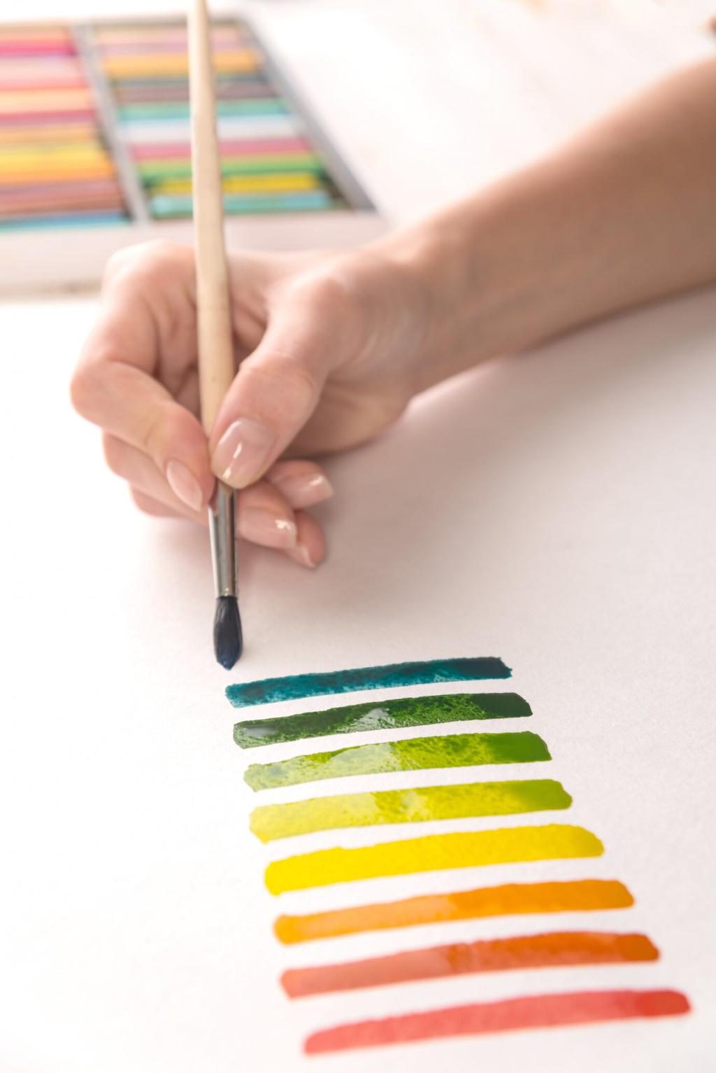
Carry a pocket set and paint five-minute swatches by light condition. Limit yourself to four pigments to avoid muddiness. Share your most surprising two-color mix that captured an entire façade convincingly.
Photos lie about color temperature. Lock white balance and bracket exposures to protect highlights and shadows. Compare screen samples to real-world swatches, then comment with adjustments you made to reclaim honest color.
Collect tiny studies of curb shadows, taxi yellows, sky reflections, and window glow. Annotate mixtures, pigments, and weather notes. Post a journal page, and we’ll suggest complementary accents for your next cityscape.
Neutrals, Accents, and Atmospheric Perspective
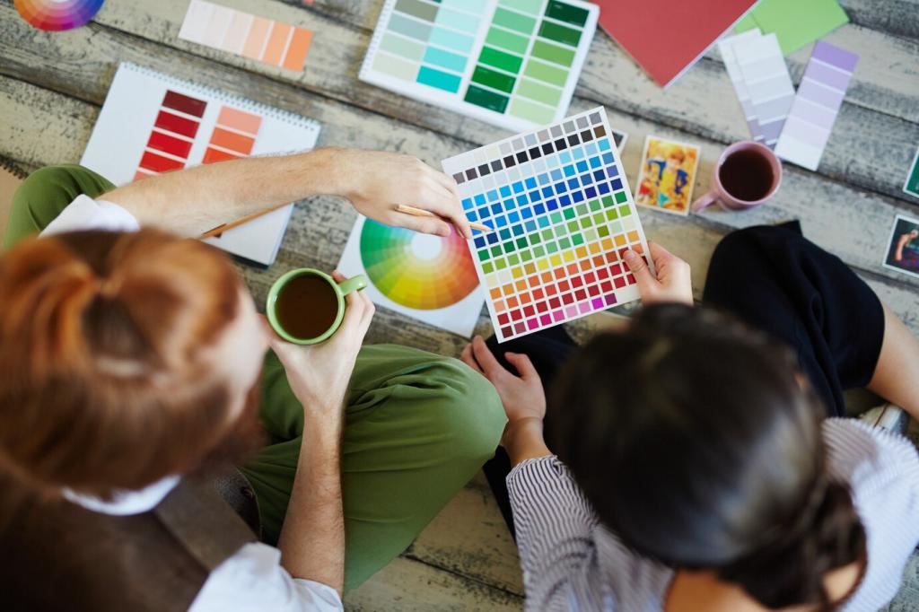
Blend complements—ultramarine with burnt sienna, alizarin with viridian—to create living grays. Let undertones peek through for texture. Share three complementary pairs you trust for pavements, stone walls, and distant rooftops.
Materials and Mediums That Shape Urban Color
Oils blend slowly for sumptuous transitions; acrylics dry fast for decisive layering; gouache offers velvety opacity. Try painting the same corner three ways, then share which medium best honored your chosen palette.
Materials and Mediums That Shape Urban Color
A toned ground biases every subsequent decision. Warm grounds enrich twilight; cool grounds clarify noon glare. Experiment with mid-value gray to stabilize contrasts. Post swatches comparing how grounds changed your color decisions.
Storytelling and Emotion with Color in Cityscapes
Winter compresses chroma, spring lifts greens, summer flares highlights, autumn warms shadows. Build a four-season palette of ten colors max. Share your list and we’ll propose swaps to sharpen your story arc.